For my breath, the photos I chose were the ones I thought were the best. They all show contrast in color, texture and shape. I think they are all different from each other, but they also relate to each other too.
|
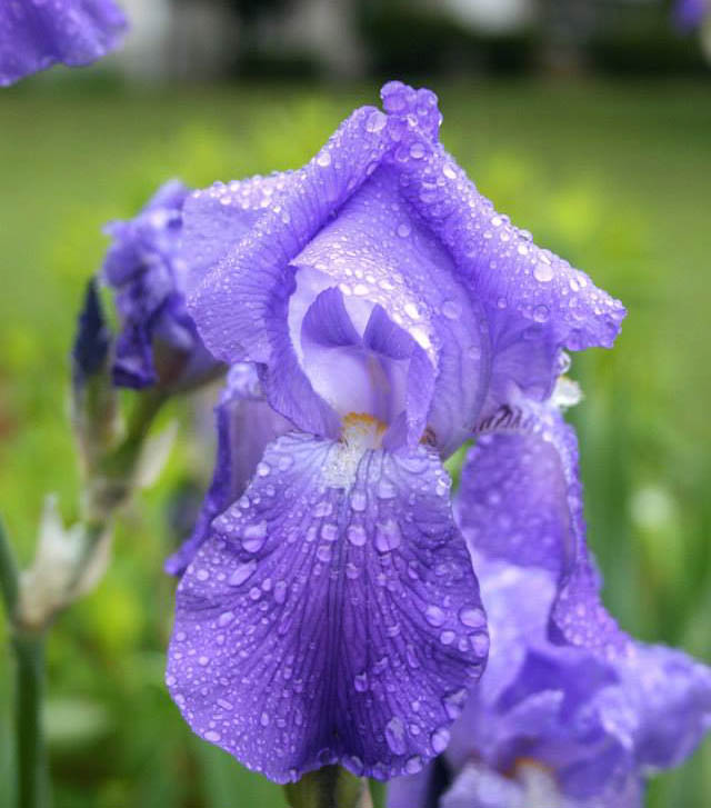
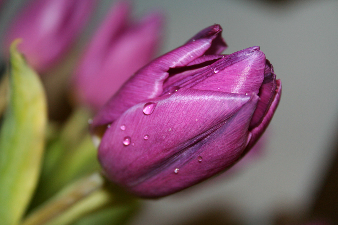
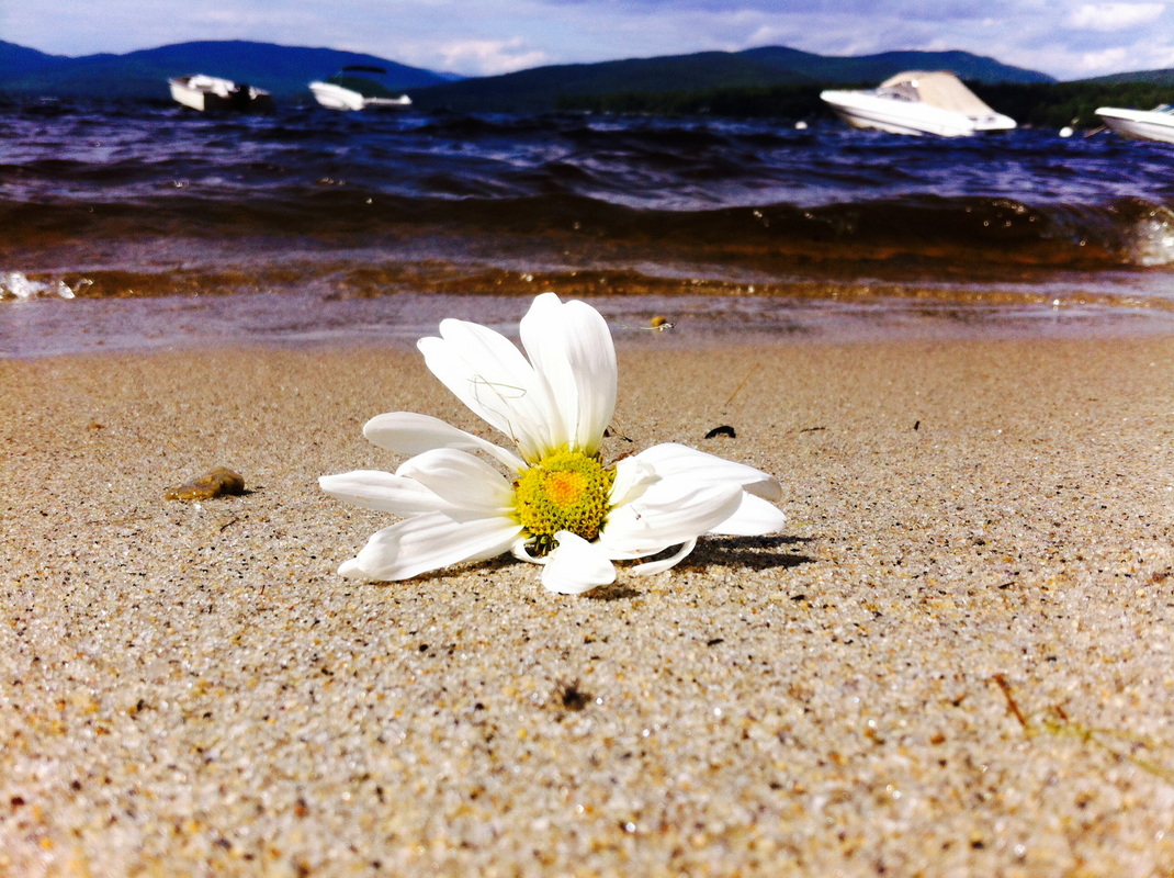
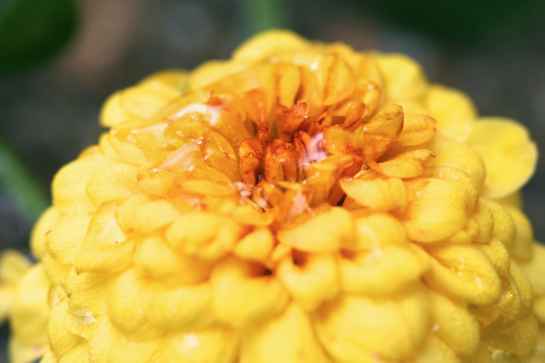
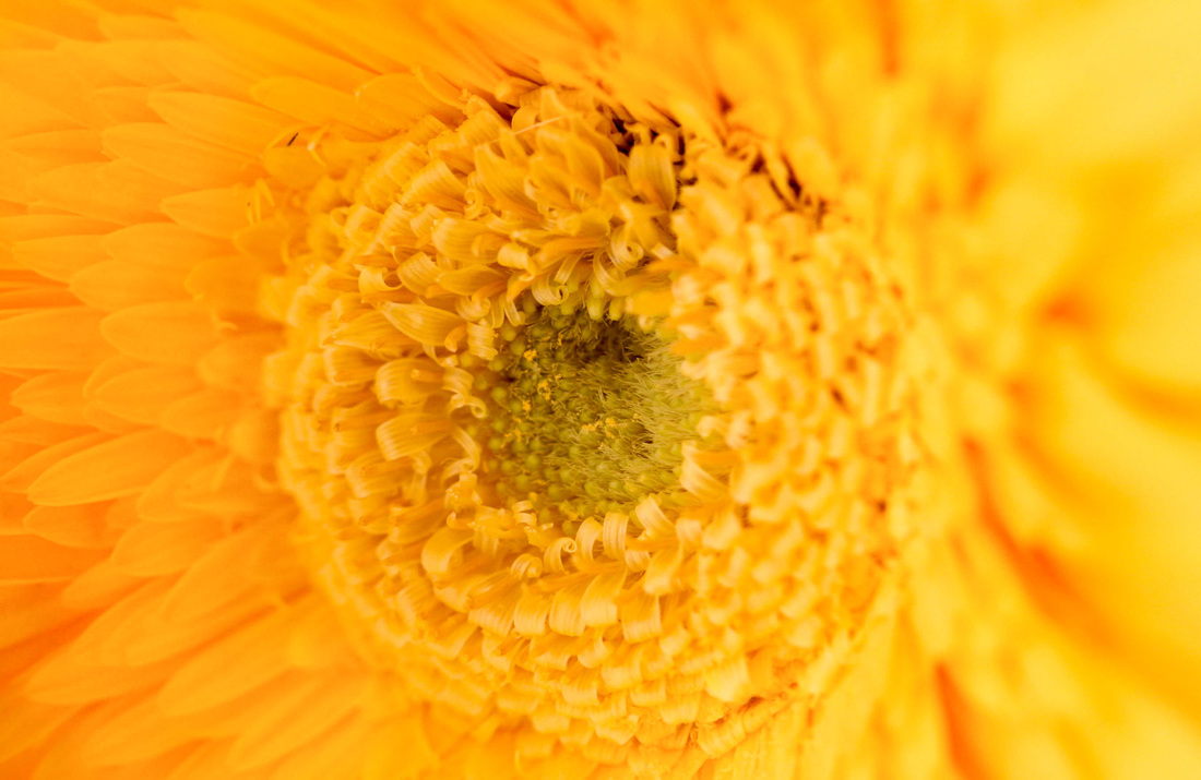
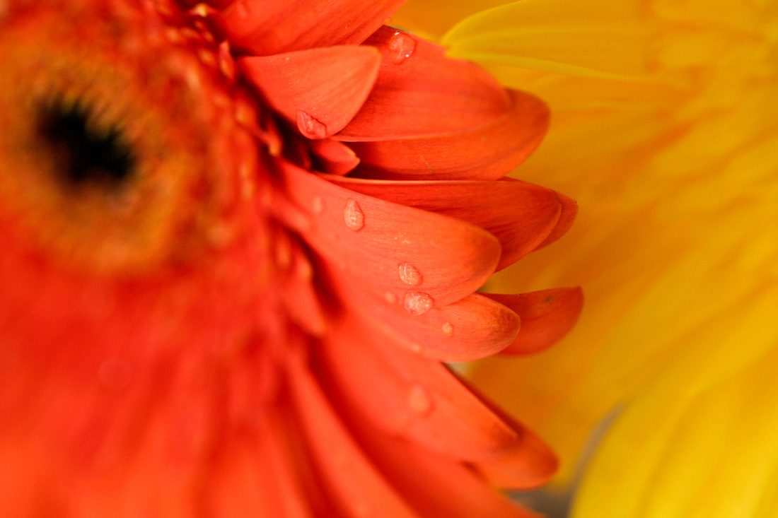
The central idea for my concentration was to capture the beauty of nature. Nature is something everyone should value and- I hoped to show the importance through the pictures I took. I wanted to highlight the variety in nature by taking pictures of different types of flowers. The visual elements of flowers seem to naturally and distinctly display the principles of design. I also wanted to show that each flower has a story behind it. My concentration demonstrates the exploration of my idea by showing the contrast in color, texture, shape and value. The color is the most important part in my concentration. It brings a vibrant look. I like how each flower varies differently. It would feel plain if I had all of the flowers looking the same. My favorite image is number seven, the bright lavender flower. It brings a lot of contrast against the other images. It’s a unique type of flower, and to have that combined with other common colors really makes a statement. Before taking pictures or doing any other types of art, it always takes me awhile to figure out what will inspire me. Sometimes I look up ideas to do on the internet and other times it’s just simply creative. However as I start my artwork I have noticed some things that affect me while creating it. One effect is that it takes me a long time to figure what I can do. I often get stuck because I want to make my art look great. Also I get into these moods when I’m extremely excited to start my project and then I just leave it half way because I get bored. With photography I mostly go and take the picture and upload them, but don’t edit them until they come across my screen again. But once I get back into the mood, I go back to my work and finish what I started. With the photos I am uploading I made my own type of style. I captured flowers with water droplets on them. For me it’s not hard to come up with ideas for photography. You just have to take the picture and see what comes out, and move on from there.
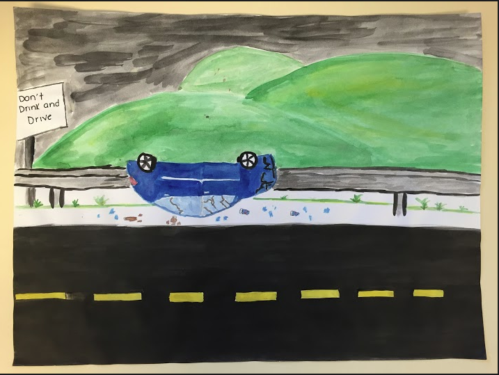 For my boundary project I did something a little different. My idea was painting a car accident, and having the guard rails as the boundary. I wanted to do a piece of art that meant something important. That had a meaning to it when you looked at it. So I incorporated the meaning to drinking and driving, and what could happen if you get behind the wheel intoxicated. My artwork is a watercolor painting of a car flipped over on it’s top. And the car is smashed up and there are beer bottles and broken glass everywhere. I drew the beer bottles to show that that is what happens if you drink and drive. Three artistic behaviors that was involved with my painting where, I collaborated with others to help me with an idea. I communicated through my work and I took chances and risks. My friend helped me come up with the drinking and driving part of my art, and including the guard rail as the boundary. Also I communicated through my work, by giving a lesson on how drinking while driving could affect one person’s life. And lastly I took chances and risk with this project, because I wasn’t sure if I could draw a car and make it look like it was in an accident. And also have my artwork send out a message. I wanted my painting to look real, however that was the one trouble I had with this project. I feel like my painting doesn’t look realistic, it looks more cartoonish. I used watercolor pencils to draw the outline and then painted in the picture with regular watercolor. Overall I think my piece of art came out good. 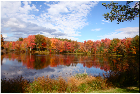 For this project I did something different than just drawing with the pen. I wasn’t a huge fan of the pen ink, because it was hard to write with and come up with good ideas. I kept messing up on the writing, the ink didn’t cooperate with me so it was difficult. So the meaning of this project “Bloom where you’re planted” is about starting something big that’s important to you in the place that inspired you to start your big plan or work of art.
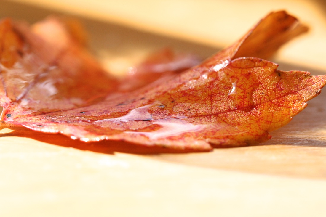
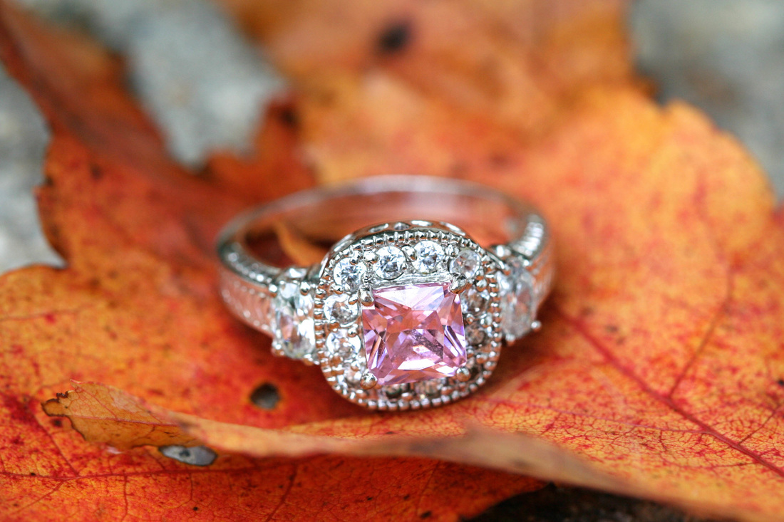
For my project I took pictures of nature, of the pretty trees that were changing around a small pond during the season fall. This connects to the saying bloom where you are planted because I was born in New England, autumn is what happens in New England. I’m inspired by fall and I love doing photography especially during this season. New England and the season fall will inspire me to make my work look awesome. Because that’s where I was planted and my work will show that I’m from New England. For this project I had many topics to choose from, which were nature, pets, family, food and life. I chose nature because nature is one of the things in my life that make me happy when looking at it. It is beautiful and calming, and it never gets old it always changes. I decided to choose colored leaves and flowers with rain droplets on them to photograph. I love the season fall, so I thought I would do some pretty red and orange leaves. I tried to photograph the leaves with water droplets on them. However it was difficult to get the droplet to look like real rain droplets. So instead I got the texture and pattern of the leaves and incorporated another value into them. I put a ring on the leaves to symbolize marriage or love. I really liked the look of it. Also I tried to do the water droplets on some mums and it actually worked. I poured my water on the flowers and the droplets stayed in place. I captured the water and the reflection of the droplets. The two artist I was inspired by were Patrick Zephyr and John Shaw, they both captured the beauty of nature. I really liked their work and how close up they got to their piece of nature that they were photographing. So to use their inspiration for my project, I used my macro lense. That makes it so I have to move closer to the object and focus it myself with the lense. 20 Things that I value: Family Nature Animals Food Photography Pets Friendship Love Happiness Art Sunsets Beaches Military Cars Creativity Camera Cell Phone Life Cooking Weather 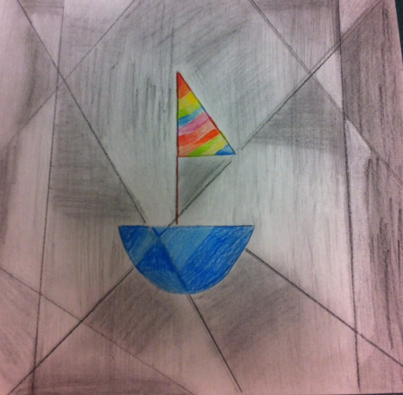 For this project I was a little confused on what to do for the assignment. It was hard to come up with an idea to draw in the middle and where to shade the background. The most trouble that I had was I didn't know how to shade differently with colored pencils in the sail boat. During the progress check of everyone else's project, mine looked completely wrong compared to theirs. If I were to do this project again, I would understand better how to shade with colored pencil and do everything else. Because I saw the examples of what the project was suppose to look like and it made it easier to see everyones project.
Brenna Nelson
September 15, 2015 AP Art Assignment Dear Mrs. Haggerty, I accomplished my goal this year by getting an A in AP Art/Studio Art. I deserved this grade by now, because throughout the whole year. I have worked very hard to complete all my tasks on time, and put my best effort in all my artwork. In the beginning of the year I had trouble with drawing self portraits, and objects with unique shapes, and taking my time without getting frustrated. Throughout the months of the school year I practiced drawing more self portraits and I really focused on the face that I had trouble with earlier in the year. Now I’m able to draw faces and objects with difficult edges and shapes. My artwork approved 100% better than is was in the beginning of the year. I learned that I needed to take more time in my drawing and work and not get frustrated so quickly. I can finally say now that I am comfortable with how my artwork has come out. And I’m not afraid of showing people what I have drawn or created. For example in the beginning of the year I did a carving for my first AP assignment. I made a tree with leaves, and I was not comfortable or positive with how it came out. I didn’t like it at all. However now at the end of the year, I look at it and realize if I were to do it right now. I would come up with a better idea and take my time on the assignment, and really focus on the details. And be more positive with my assignments. Overall throughout the year I learned about the techniques of how to do art and make it better. For myself I feel like I became a better artist than I was in the beginning of the year and really made an improvement in all that I have accomplished 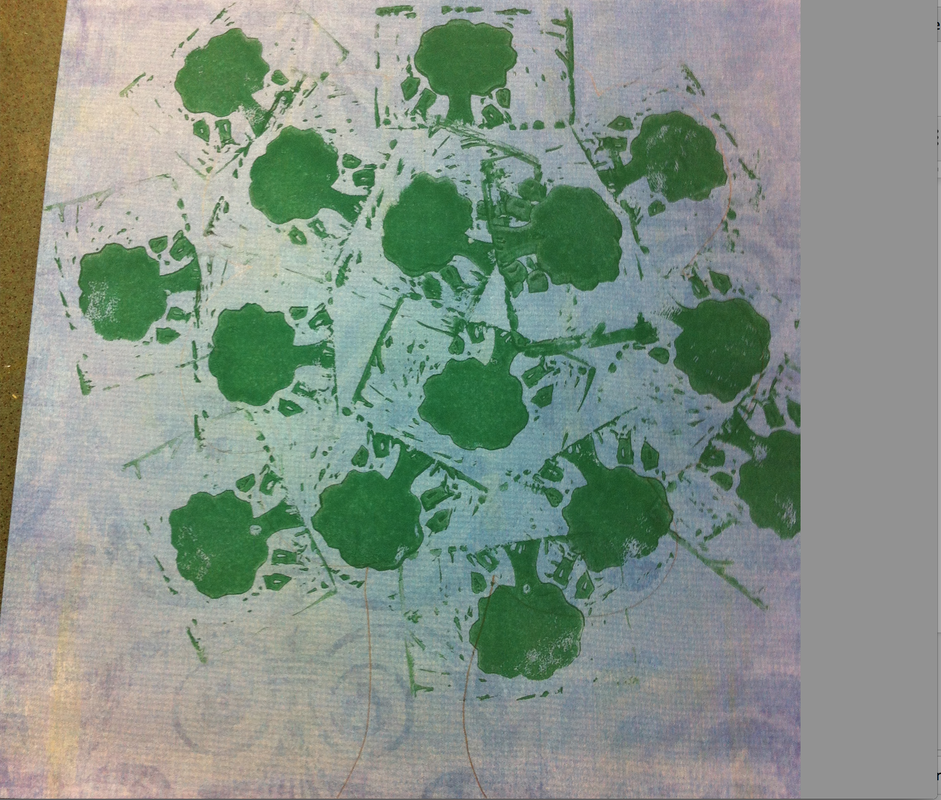 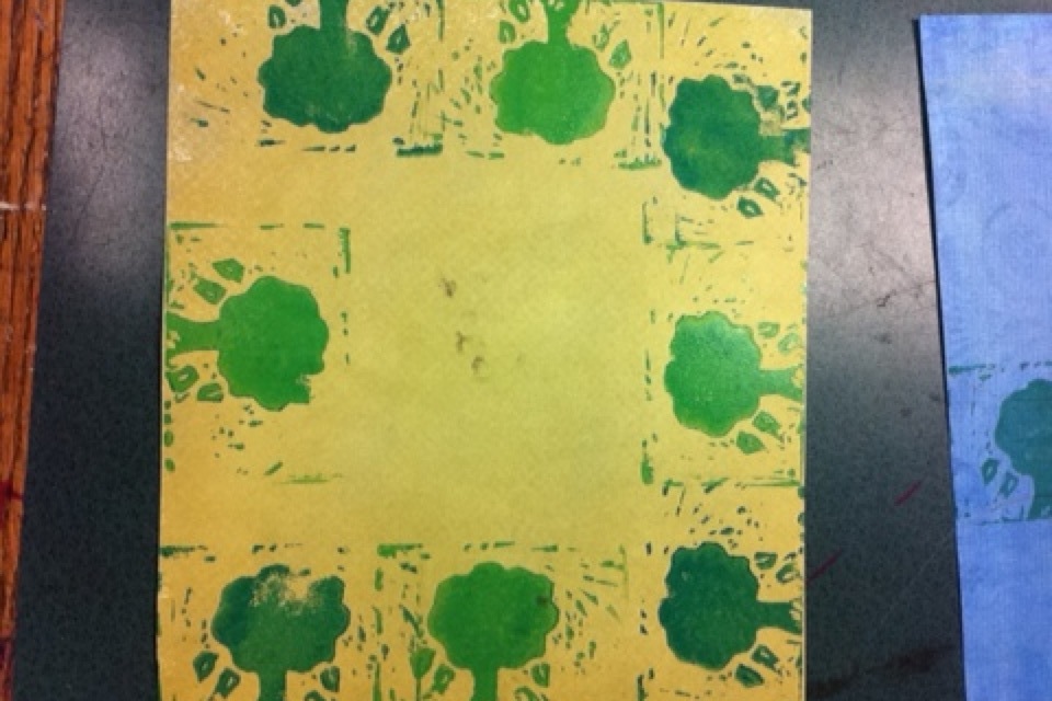 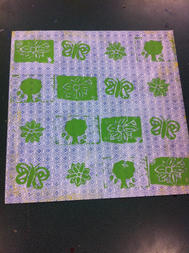 The first project of the year was the Carving Stamps. I did something similar to this project a few years ago, but it was with a bigger piece of carving block. So I knew what I was doing, after I remembered what this project was. With the theme of this project being nature, I drew a bunch of designs first. Which were different flowers and a tree, it seemed like everyone was doing flowers so I decided to do a tree. After finishing my designs I took my piece of block, and put the piece of paper with the design that I made over the block. And then took a pencil and shaded the back of the block on the paper. So when I took the paper off, my design for my stamp was on the block. So all I needed to do was trace it with sharpie and then start carving. I liked the idea of the tree, because I thought it would look cool with some type of design. So on my block I had a tree with leaves falling off of it. It was something different. When it was time to stamp I colored my stamp with green paint. And as a interesting thought I thought of making a large tree out of the little tree that's on my stamp. It didn't come out the way I wanted it to, because the shape of the tree didn't really look like a tree. So I made another idea on a colorful sheet of paper. And put the trees around the border of the paper, making a frame. I loved how the second one came out. Then for the group project we did vertical lines going down the decorative paper, with different routines of the other stamps that the people had in our group. It came out really good and creative. 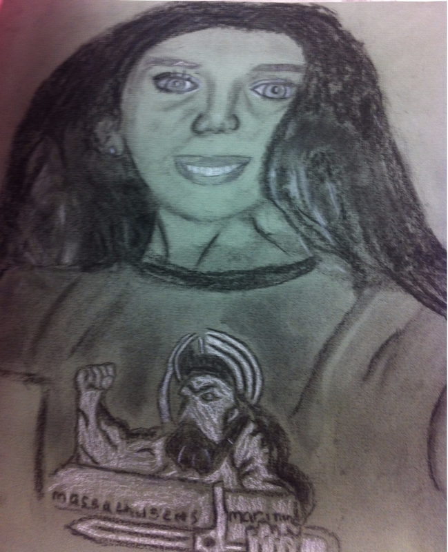 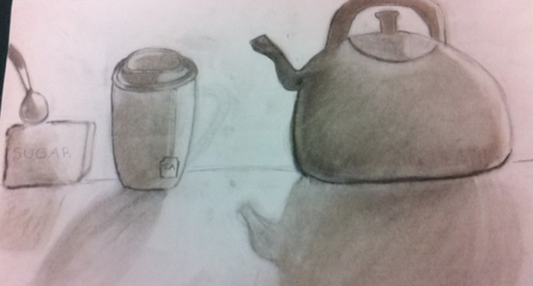 For the first project, which was the still life, it was kind of hard actually to find objects that wouldn’t be too hard to draw. I tried a bunch of different ideas like books and a lamp, however the shadowing and drawing was difficult. So finally I took a tea kettle, and a mug with a cup of sugar. That were much easier shapes to draw. And I started to see the definition of shadows in the object. They were much better defined than the other ideas I had before. I had trouble with the shadowing and how to shape it. But overall I think my drawing came out good.
The self portrait was probably one of the hardest drawings I have done. I’m not very good when it comes to drawing faces. At first I didn’t know how to use the charcoal or the different shades of pencils. But once I got lessons I understood it better. When I started to learn the concept of the utensils the drawing started to really approve. It was difficult doing some parts of the face, like the eyes and mouth. Because I wanted it to look more realistic which was one of the struggles I had. But besides having the image a little unproportional from the real picture, I really think for drawing a self portrait for the first time came out great. |